box 盒子容器 note 标签就是使用 box 容器实现的,它们样式是相同的:
语法格式 {% box [title] [color:color] [child:codeblock/tabs] %} ... {% endbox %}
彩色代码块 设置 child:codeblock 并设置 color:颜色枚举 可以实现 10 种不同颜色的代码块,彩色代码块一般可以用在代码正确与错误的示范对比场景。
嵌套多段代码块 同一个 box 标签里面直接放多个代码块就可以啦:
发送端 + (void )test { [NSNotificationCenter .defaultCenter postNotificationName:@"test" object:nil ]; }
订阅端 func setup () { list.add(title: "test" ) { section in section.add(title: "设置 Observer" ) { NotificationCenter .default.addObserver(self , selector: #selector (self .onReceive), name: .init ("test" ), object: nil ) } section.add(title: "发通知" ) { OC .test() } } } @objc func onReceive (other : (() -> Void )? = nil ) { Capsule ("收到通知" ) }
嵌套其它标签 例如嵌套一个 tabs 标签:
公司一般都会强制安装安防软件,这些软件要求开机自启动,要求有屏幕录制权限、完全的磁盘访问权限包括相册图库。因此如果使用自己的 MacBook 作为办公设备,必须要把生活区和工作区完全独立开,安装在两个磁盘分区,并且对磁盘分区进行加密。
folding 折叠容器 折叠块标签的语法格式为:
{% folding title [codeblock:bool] [open:bool] [color:color] %}
content
{% endfolding %}
参数说明 codeblock: true /false open: true /false color: red/orange/yellow/green/cyan/blue/purple/light/dark
彩色可折叠代码块 备注标签相较于旧版进行了增强,可以实现更多种颜色,还可以通过设置 child:codeblock 来实现可折叠的代码块。以下是一个默认打开的代码折叠框:
默认打开的代码折叠框
func test () { print ("hello world" ) }
代码如下:
{% folding child:codeblock open:true color:yellow 默认打开的代码折叠框 %}
代码块
{% endfolding %}
危险,请不要打开这个
通过设置颜色,以实现更醒目的作用,但不要滥用色彩哦~
警告,真的很危险
通过设置颜色,以实现更醒目的作用,但不要滥用色彩哦~
最后一次警告,千万不要打开这个
不要说我们没有警告过你,Windows 10 不是為所有人設計,而是為每個人設計。
folders 多个折叠容器聚合 样式相比 folding 简单一些,适用于多个折叠标签平铺显示的场景,例如题目列表:
代码如下:
{% folders %}
<!-- folder 题目1 -->
这是答案1
<!-- folder 题目2 -->
这是答案2
<!-- folder 题目3 -->
这是答案3
{% endfolders %}
tabs 分栏容器 这个标签移植自 NexT 主题,但做了以下修改:
支持设置 align:center 来使内容居中
设置默认激活的标签方式为 active:1 而非 , 1(使用默认格式降低学习成本,且显式声明可读性更强)
不需要 <!-- endtab --> 来作为结束标识(因为 Stellar 会自动判断)
不需要 tabs id 来保证唯一性(因为 Stellar 会设置唯一标识)
不支持 @icon 方式设置图标(因为 Stellar 不再内置 fontawesome 图标库)
轮廓样式简化,可以搭配其它容器类标签嵌套使用。
let x = 123 print ("hello world" )
grid 网格分区容器 这个功能在 1.24.0 版本后获得重构,支持固定列数、动态列数、设置间距和圆角。
默认的布局为【最小宽度为240px】即如果页面宽度大于 480px 则会显示为 2 列,大于 720px 则会显示为 3 列,以此类推,下面是效果:
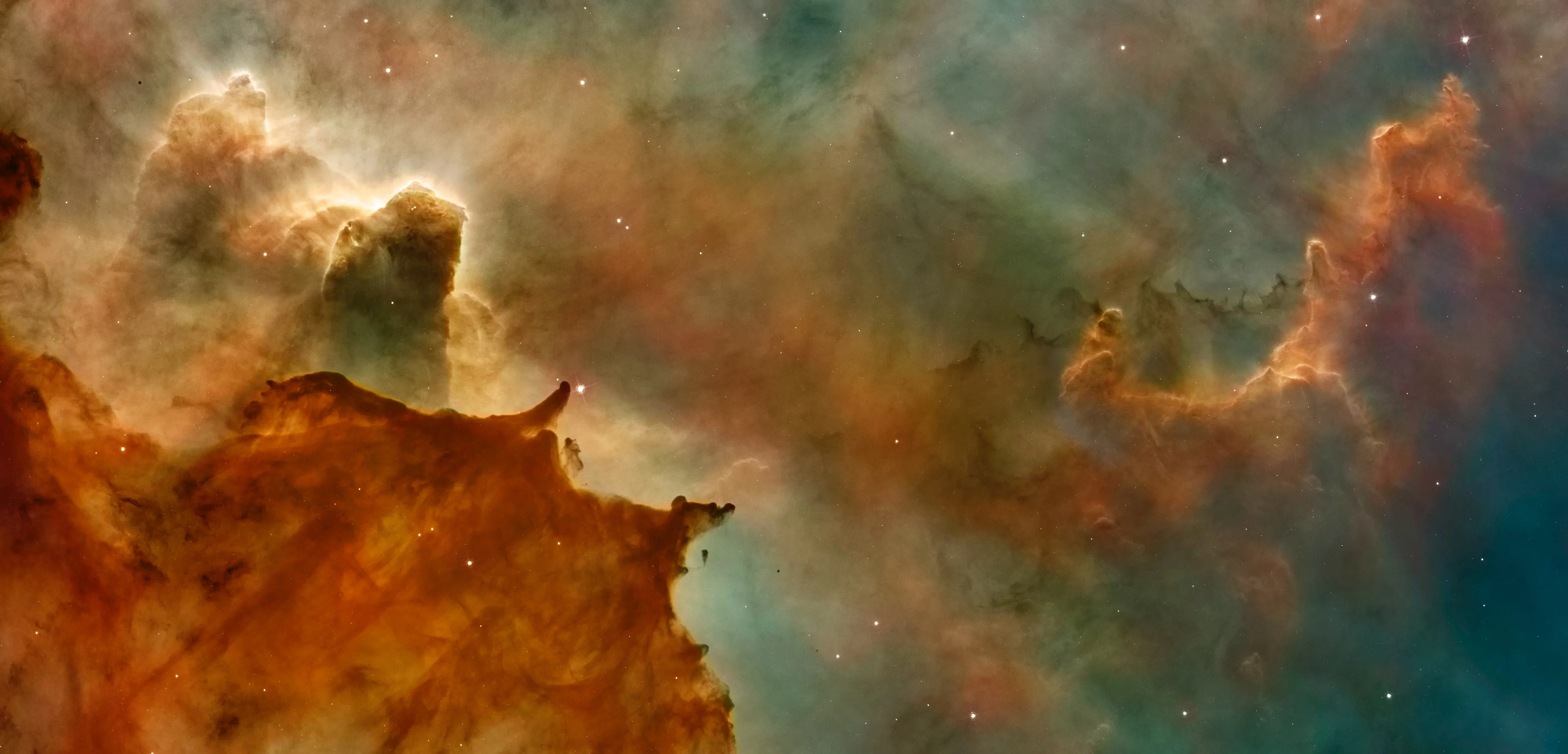
Unsplash Photo
The Galactic Center is the rotational center of the Milky Way galaxy. Its central massive object is a supermassive black hole of about 4 million solar masses, which is called Sagittarius A*. Its mass is equal to four million suns. The center is located 25,800 light years away from Earth.
Ōwhiro Bay, Wellington, New Zealand
示例写法如下: {% grid %} <!-- cell --> {% image https://images.unsplash.com/photo-1653979731557-530f259e0c2c?ixlib=rb-4.0.3&ixid=MnwxMjA3fDB8MHxwaG90by1wYWdlfHx8fGVufDB8fHx8&auto=format&fit=crop&w=774&q=80 download:https://unsplash.com/photos/bcql6CtuNv0/download?ixid=MnwxMjA3fDB8MXx0b3BpY3x8NnNNVmpUTFNrZVF8fHx8fDJ8fDE2Njg4NDAxMDI&force=true ratio:774/1161 %} <!-- cell --> **[Unsplash Photo ](https://unsplash.com/photos/bcql6CtuNv0 )** The Galactic Center is the rotational center of the Milky Way galaxy. Its central massive object is a supermassive black hole of about 4 million solar masses, which is called Sagittarius A*. Its mass is equal to four million suns. The center is located 25,800 light years away from Earth. > Ōwhiro Bay, Wellington, New Zealand > Published on May 31, 2022 > SONY, ILCE-6000 > Free to use under the Unsplash License {% endgrid %}
如果要修改最小宽度,可以这样写:
{% grid w:350px %}
...
{% endgrid %}
如果要固定为 2 列,可以这样写:
{% grid c:2 %}
...
{% endgrid %}
普通 Box 样式:
可浮起的卡片样式:
示例写法如下: 普通 Box 样式: {% grid bg:box w:150px %} <!-- cell --> cell 1 <!-- cell --> cell 2 <!-- cell --> cell 3 <!-- cell --> cell 4 {% endgrid %} 可浮起的卡片样式: {% grid bg:card w:150px %} <!-- cell --> cell 1 <!-- cell --> cell 2 <!-- cell --> cell 3 <!-- cell --> cell 4 {% endgrid %}
默认间距为 16px,如果需要修改,可以这样写:
{% grid bg:card gap:32px w:120px %}
<!-- cell -->
cell 1
<!-- cell -->
cell 2
<!-- cell -->
cell 3
<!-- cell -->
cell 4
{% endgrid %}
默认圆角半径等同于卡片的圆角半径,如果需要修改,可以这样写:
{% grid bg:card br:4px w:150px %}
<!-- cell -->
cell 1
<!-- cell -->
cell 2
<!-- cell -->
cell 3
<!-- cell -->
cell 4
{% endgrid %}
这里的 br 是 border-radius 的缩写,虽然和 <br> 易混淆,但是我不知道是否有其他更好的命名,全称太长了。
banner 横幅容器 这个功能在 1.21.0 版本后开始支持,将会取代 about 组件,请尽快完成迁移。
用于独立页面顶部
写法如下: {% banner 随记 bg:https://res.xaox.cc/gh/cdn-x/xaoxuu@main/posts/20250706164631268.webp %} {% navbar active:/notes/ [随记 ](/notes/ ) [收藏 ](/bookmark/ ) %} {% endbanner %}
用于用户个人资料页
写法如下: {% banner 某某 这是个人简介 avatar:https://res.xaox.cc/gh/cdn-x/xaoxuu@main/avatar/classic.webp bg:https://res.xaox.cc/gh/cdn-x/xaoxuu@main/posts/20250706163949681.webp %} {% endbanner %}
用作文章摘要卡片 设置 link 可以让整个卡片响应点击事件,实现点击跳转到对应文章:
{% banner 博客进阶:自动化部署 本文讲了如何利用脚本和 GitHub Actions 简化博客搭建和部署流程,提高效率。 bg:https://res.xaox.cc/gh/cdn-x/xaoxuu@main/posts/20250706160404696.webp link:/blog/20221126/ %}
{% endbanner %}
博客进阶:自动化部署
本文讲了如何利用脚本和 GitHub Actions 简化博客搭建和部署流程,提高效率。
gallery 图库 这个功能在 1.21.0 版本后开始支持,其内部只能填写 md 格式的图片。
@tianhao_wang
@eberhard
@eberhard
@eberhard
@eberhard
@vklemen
写法如下 {% gallery %}      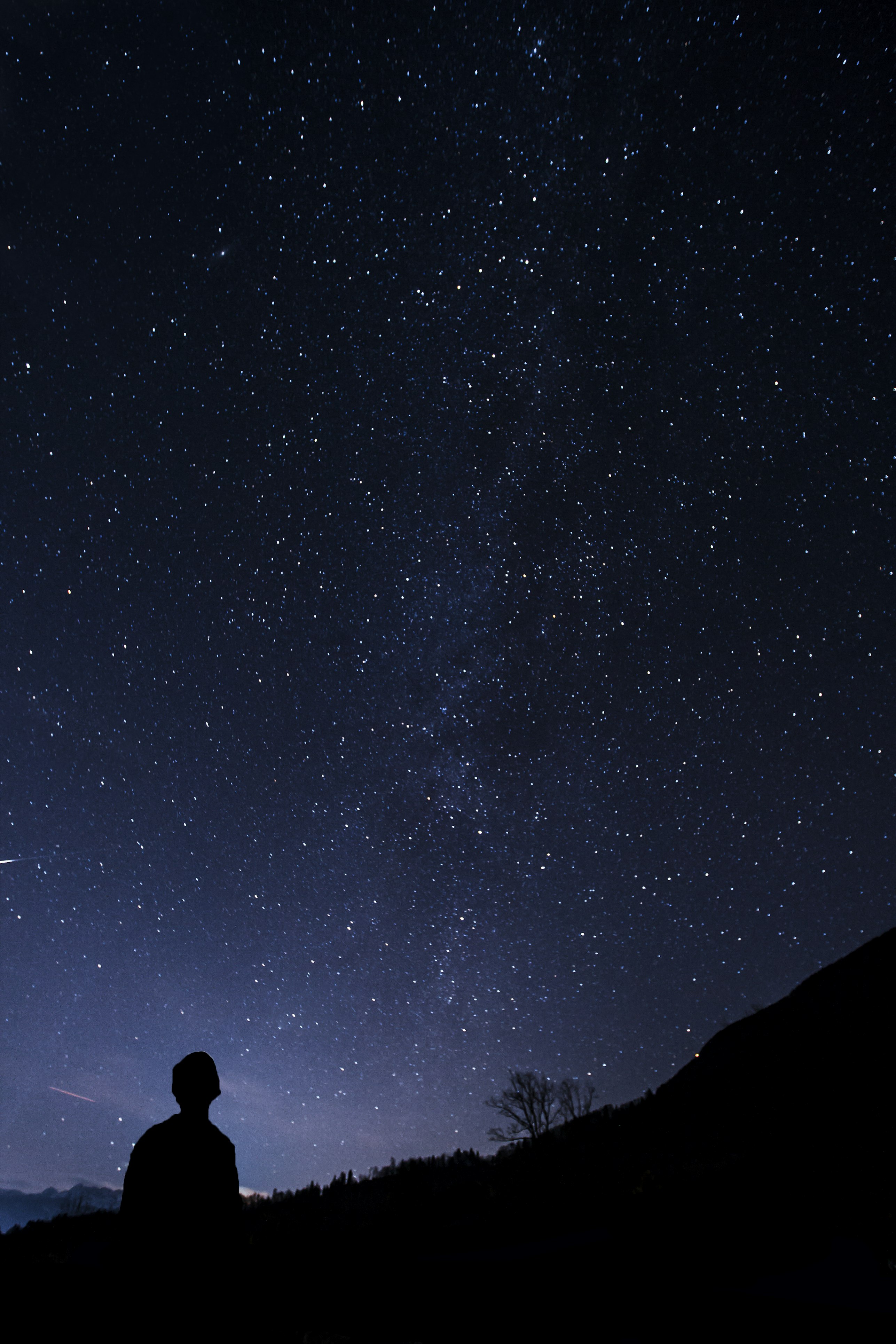 {% endgallery %}
详细用法请看这篇文章:
swiper 轮播容器 默认一张图片是 50% 宽度,通过设置 width:min 设置为 25% 宽度,width:max 设置为 100% 宽度。
写法如下 {% swiper effect:cards %}     {% endswiper %}
写法如下 {% swiper width:min/max %} ... {% endswiper %}
{% swiper effect:cards/coverflow %}
...
{% endswiper %}
注意
一个页面只能设置一次,第一个 swiper 容器的效果全局生效。